Back to Dude Intelligence for Gov-Healthcare-Clubs Main Menu
Dude Intelligence is a tool that combines powerful Key Performance Indicators (KPIs), reporting tools, and an operations dashboard that leverages the experience and data of thousands of clients across multiple industries. It can help you monitor, maintain, and improve the performance of your teams, as well as compare your performance against that of your peers. Dude Intelligence gives you access to over 50 KPIs and trends designed to help you further leverage your applications' data.
Watch the Video Tutorial:

Browser Recommendations
Windows
- Internet Explorer 11 or higher
- Chrome's most recent version
- Firefox's most recent version
Mac
- Safari 8 or higher
- Chrome's most recent version
- Firefox's most recent version
How to Access Dude Intelligence
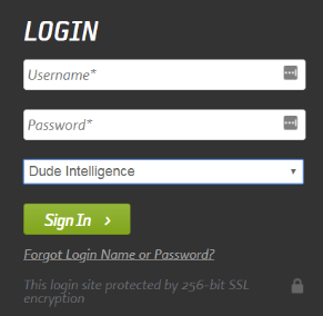
Dude Intelligence is accessible from the Login page and the Applications drop down box. You will access Dude Intelligence just like you access your other Brightly applications.
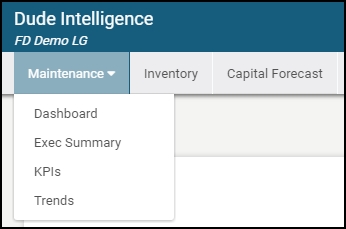
- You can access information for the different Brightly applications you subscribe to using the tabs at the top of the home page. The home page will default to the Maintenance Dashboard.
Dashboard
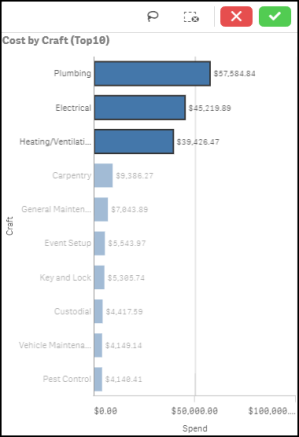
The Operational Dashboard allows you to drill-down into your applications' data to give you a bigger picture into the work you are doing. This data updates every night and includes 3 calendar years of data in addition to the current year through yesterday.
- Use the Dashboard drop down in the top right corner of the screen to change your Dashboard view.
- You can also filter the Dashboard using the drop down filters across the top. If you do filter using these drop downs, a green indicator will appear under that field to let you know you have made filter selections.
- To clear your filter selections, click the Clear All Filters button on the right side of the screen.
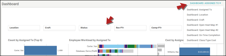
- Within each chart or section of the Dashboard, you can make selections to narrow down the data. Select the information in the graph you want to view and click the green checkmark. The rest of the dashboard will be filtered by these selections as well.
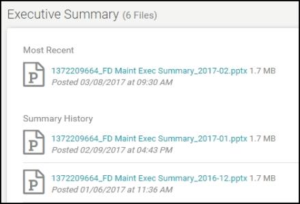
Executive Summary
Executive Summaries are automatically generated on a monthly basis, putting your KPIs into a professional PowerPoint so you can present them to your leadership teams. This data is updated every month and includes a rolling 12 months worth of data. For example, if you are viewing your March 2017 Executive Summary, it will include data from the first of March 2016 through the end of February 2017.
- Click on the most recent Executive Summary in the list to download the file.
- Previously generated Executive Summaries are listed under the Summary History so that you can compare your data over time.
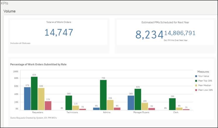
KPIs
Key Performance Indicators are quantifiable measurements that show how effectively your organization is achieving key business objectives and compares your performance to peers in your industry. They are commonly used to evaluate the level of success of a particular activity or progress toward a desirable goal. These KPIs report on volume of work, efficiency, and data quality. This data is updated every month and includes a rolling 12 months worth of data. For example, if you are viewing your KPIs in March 2017, then you will see data from the first of March 2016 through the end of February 2017.
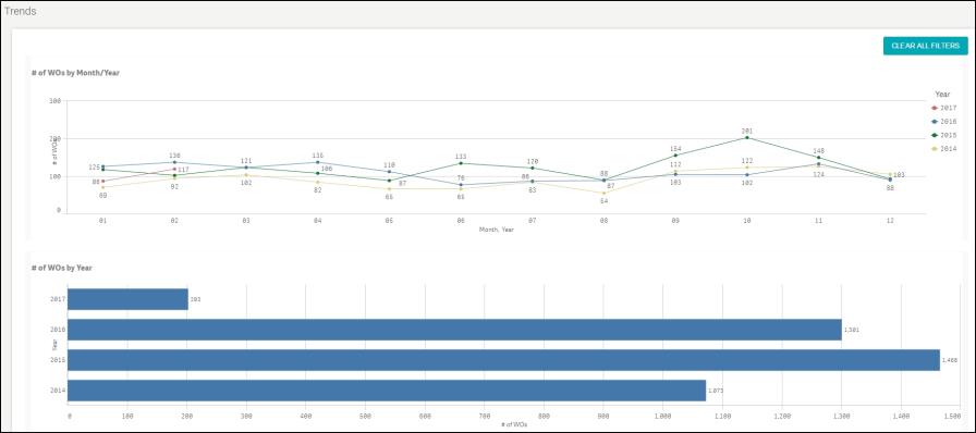
Trends
Trends allow you to have a historical view of performance to understand your teams' improvement over time. You are able to drill down on specific trends to gain a greater understanding of your teams' performance. This data updates every month and includes 3 calendar years of data in addition to the current year to the end of the previous month. For example, if you are viewing trends in March 2017, you will see all data from the calendar years of 2014, 2015, and 2016, along with the data from January and February of 2017.